According to 42 Matters, there are 1.8 million apps available for download on the App Store and 3.3 million on the Google Play Store. Although these numbers are striking, not all of these applications have great UI/UX designs that satisfy users. There are many bad mobile app designs. In this article, we highlight general mistakes you should avoid when designing a new mobile application.
Designs that don’t answer consumers’ needs
Mistake
Why do users download any mobile application? Because it promises to solve their vital problems. But sometimes, users don’t understand what to do with an application after the first launch. This can occur for various reasons:
- Poor analysis of the target audience and ignorance of pain points that need to be addressed.
- Lack of functionality that could solve a specific problem of users or too many tools that aren’t relevant to solving the main problem.
- Poor analysis of competitors. As a result, you might occupy a niche that’s already full of similar applications.
All of these things can negatively affect your application. If users think your application doesn’t solve their problems, they may decide to uninstall it.

Solution
Know your users. This is the main tip to avoid purposeless mobile application design. User research, interviews, and surveys are the best ways to get to know your users — and to build a mobile app that meets their needs and wants.
Don’t copy. Why do users need a copy of an application they already have? Imitation is an easy way to make an unsuccessful mobile application. Take time to come up with your own unique idea, develop templates with your design team, and test them. Don’t be afraid to spend time at the ideation stage.
Conduct market and competitor analysis. When developing an application for the first time, don’t skip market research. Using data obtained during market research, you can study market positions that are worth achieving. Market research can also give you detailed information about competitors, giving you a chance to avoid their mistakes. Only after conducting research should you can begin to design your application.
Poorly optimized user flow
Mistake
Your app’s information architecture (IA) provides a plan for the growth of your mobile application and a path for your users. With a well-optimized user flow, users can meet their goals smoothly. Missing this design stage will put you in a situation akin to getting lost in a rural area without GPS. It’s essential to develop a sophisticated user flow with clear logic and a clear features hierarchy. Don’t let users miss features they really want or need.

Solution
Plan the design process. Before going to the development stage, it’s crucial to design the IA and user flow. Don’t swap the order of these stages and don’t rush. Plan your design process and do everything step by step to get an excellent UI/UX app design.
Carefully design the user flow. The main purpose of a user flow is to visualize the path the user will follow when interacting with the application. Usually, this is visualized as a flowchart created by designers in order to set feature priorities according to users’ needs. Don’t be afraid to spend time at this stage because the more accurate the user flow, the more likely the application will be well-designed.
Lack of context
Mistake
You may have an idea for how to make an app in a better way and how to get potential users interested in it. However, odds are that you’ll place your product in the wrong interaction context. This may happen due to unclear project goals or poor communication with your design team. But it can also occur because you scale your product too fast and don’t focus on achieving one specific goal.
Let’s look at an example of a bad mobile app design example. Suppose you’ve developed a banking application. A user needs to transfer money to another account quickly, but they discover it’s a headache to do so. Instead of rapidly performing this operation, they have to enter personal data, follow links, and take other actions. This makes the customer journey difficult.
Solution
Set explicit app objectives. Think about the real goals of your users. Should the app be useful with a quick tap of the finger or hold the user’s attention for a long time? Where does your audience use the application? Put your product in the context of user interactions.
Trust professionals. What seems like a good idea may not always work well. Share your thoughts with professional design teams to get an outside opinion. This approach will help you stay close to your audience and design a mobile app they’ll like.
Poor first impression and onboarding
Mistake
When users launch a new mobile app, they expect to get right to the point. A good or bad first impression will determine whether users continue to use your application or immediately delete it. A good first impression and a clear registration process is what users want. If a user doesn’t understand what their next step should be right after opening the app or if the interface seems unattractive, problems may arise. Most likely, your application will become an example of bad mobile app design.
Solution
Make a short tutorial with tips. The first interaction with a mobile app is like a first date — you need more information to get to know each other. In this case, the best solution is a short tutorial about your application. Give some tips and information on how to use the application. Describe the app’s purpose and let users understand its value.
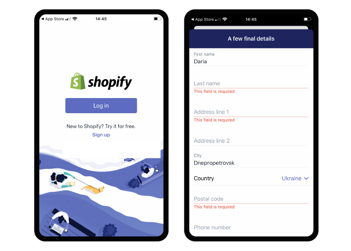
Shopify is an e-commerce platform for creating online stores. It’s a great tool, but the Shopify application has some flaws. When starting the application for the first time, the user is faced with long forms to fill out. In fact, the user is forced to first register, then find out what awaits them. It would be better if users were greeted with a brief explanation of the purpose of the application.

Be bright. Add a couple of bright elements to be remembered. A colorful gradient or animation works well. But remember that balance is needed everywhere. Don’t overwhelm the user with too many elements.
Poorly designed push notifications
Mistake
Notifications allow users to quickly react to important messages . A lack of notifications or poorly designed notifications is a big mistake that will turn away potential users. Push notifications are a great marketing tool. Use them correctly to benefit from them.
Solution
Make notifications interactive. It’s not enough to notify users of new messages or events. Design notifications to be comfortable and let users interact with them quickly. If you’re building a messenger, let your users reply to messages by clicking a notification and without going into the application. If you’re sending a reminder for an important event, let users choose to be reminded later or delete the notification without unlocking the phone.
Personalize notifications. For important push notifications such as from a bank about a withdrawal or a reminder about the end of a subscription, the interface is essential. The information in such notifications should be instantly noticeable. Emoji or different text designs are often used to accomplish this.
Overcomplicated and cluttered app design
Mistake
Mobile applications by their nature should be simple to use. And mobile users want easy-to-use apps. Overcomplicated and cluttered designs may overwhelm users. Don’t overload your application with unnecessary features or awkward graphics.
Solution
Prioritize features. There are a lot of features you can put into your application. But smartphone screens are limited. Each button, image, and line of text makes the screen more complex. Less is more, and you should be critical of all elements. Many features don’t improve the user experience. So prioritize features and display those that do.
Make a prototype. Before releasing your application, conduct a series of tests using prototypes. This will show you a picture of where users can get stuck and relevant features that you should polish or remove.

Inconsistent design
Mistake
It’s important to understand that when interacting with applications, users follow their intuition and experience expectations. If these expectations don’t coincide with reality, the application will seem confusing and complicated. This applies not only to the user experience but also to the user interface. Using different icons for the same feature or different graphic styles might cause your users to find themselves with mixed emotions about your application.
Solution
Create a style guide. There are a lot of methods to avoid inconsistency, but the main one is creating a style guide. This is a written document that contains your app’s key design elements and styles and explains how to use them. Create such a guide with your design team before moving on to the UI design stage. This will help you avoid mistakes and achieve consistency during the design process.
Be predictable. Users bring their previous experiences to new applications. This means applications should feel familiar. To make apps feel familiar, just follow the Google Material Design guidelines for Android and the Human Interface Guidelines for iOS. By doing so, you’ll create a native app design that meets your users’ expectations.
Summing up
A great mobile app idea isn’t enough for your business to blossom. It’s important to know the design features and design process and also to know your audience. Creating a quality product on the first try is almost impossible. Design is a constant process and requires constant work on bugs. But by knowing the most common mistakes, you’re more likely to create a product that will meet users’ expectations.The UGEM team is always available to help you design mobile applications. Contact our design team to build an outstanding mobile app.


UGEM Blog
Sign In to leave comments and connect with other readers
Sign in with Google Sign in with Linkedin