A Voting App for Product Idea Validation
Vootex
Overview
Vlad Gorodetsky, an entrepreneur from San Francisco, approached UGEM with an idea of an app that will allow companies and entrepreneurs to test their product ideas before investing heavily in it. The app was going to collect market feedback on product ideas and existing products to map paths for improvement.
The UGEM team had to create UI/UX design for this new platform from scratch.
Project Profile
Business owners who need to validate ideas before launching products or services or test existing products
Users who are active on social apps and open to sharing feedback and participating in surveys
Design objectives
After Vlad Gorodetsky contacted our team, we defined the scope of work, project timeline, and most vital design objectives. For this project, we needed to:
- Create intuitive and minimalistic UI/UX design using familiar to users elements to make the interaction as simple as possible
- Provide companies and entrepreneurs with easy to perceive visualization of analytics data
- Create a simple but comprehensive design for voting and survey features
- Make the app more recognizable and engaging with the help of custom illustrations
We started the project with
User flows
We create user flows to figure out how real people will use your app from the time they open it to the time they exit. User flows help us determine the content and functionality that must be on a page. Our aim is to align user flows with users’ specific goals.
Wireframes
Wireframes and prototypes visualize a user’s interactions with an interface. This stage helps us review design solutions with project stakeholders, test them before implementation, and quickly make necessary amendments.
Library of component
Creating a library of components allows us to speed up development, maintain visual consistency, and successfully scale a product without any design discrepancies.
Design solutions
To reach the objectives of the project, the UGEM team came up with the following design solutions:
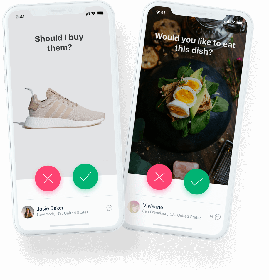
UI/UX design as in social media
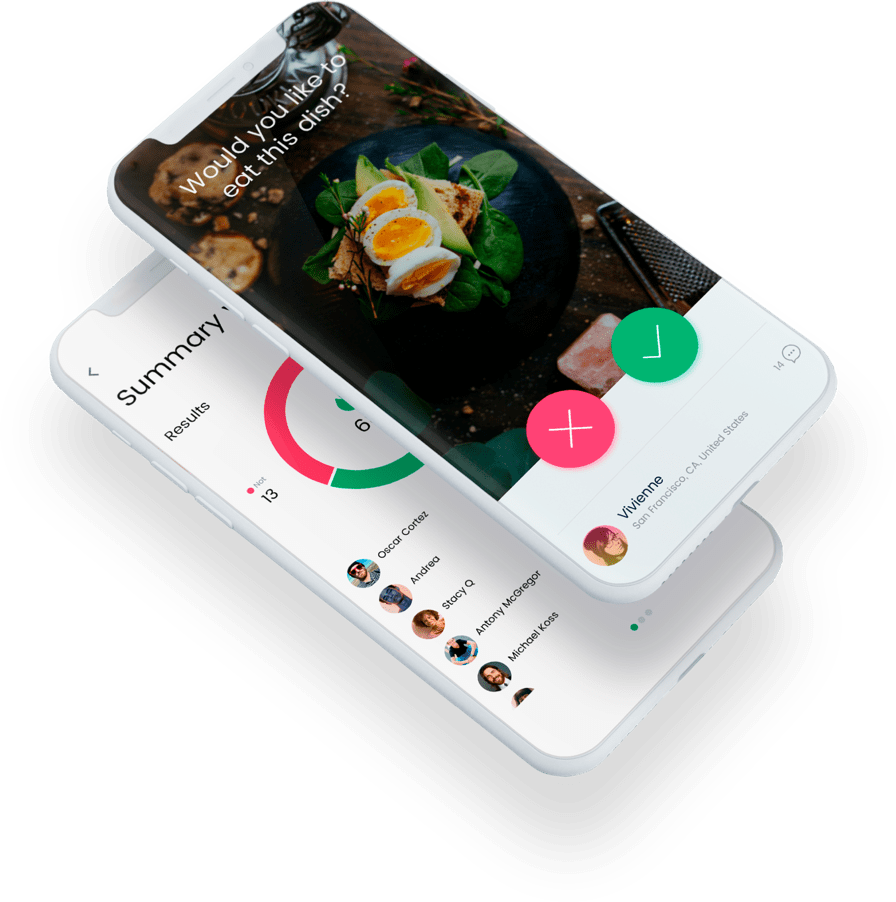
To ensure the application is intuitive, offers simple navigation, and facilitates smooth micro-interactions between users, we chose to design the app as a social media. We created a light and airy minimalistic interface that looks familiar to all social media users.
Creating a design for this native iOS mobile app, we followed the Human Interface Guidelines, which also allowed us to make the UX design familiar to users that streamlines onboarding.
Simple Analytics and Visualizations
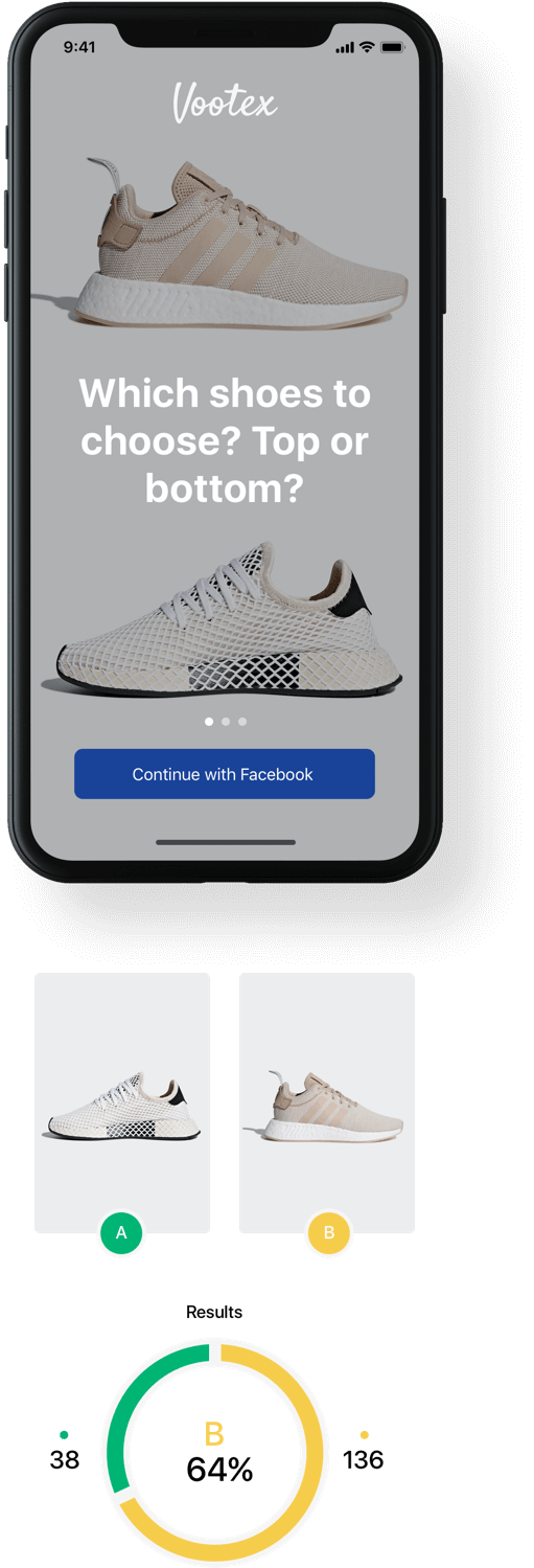
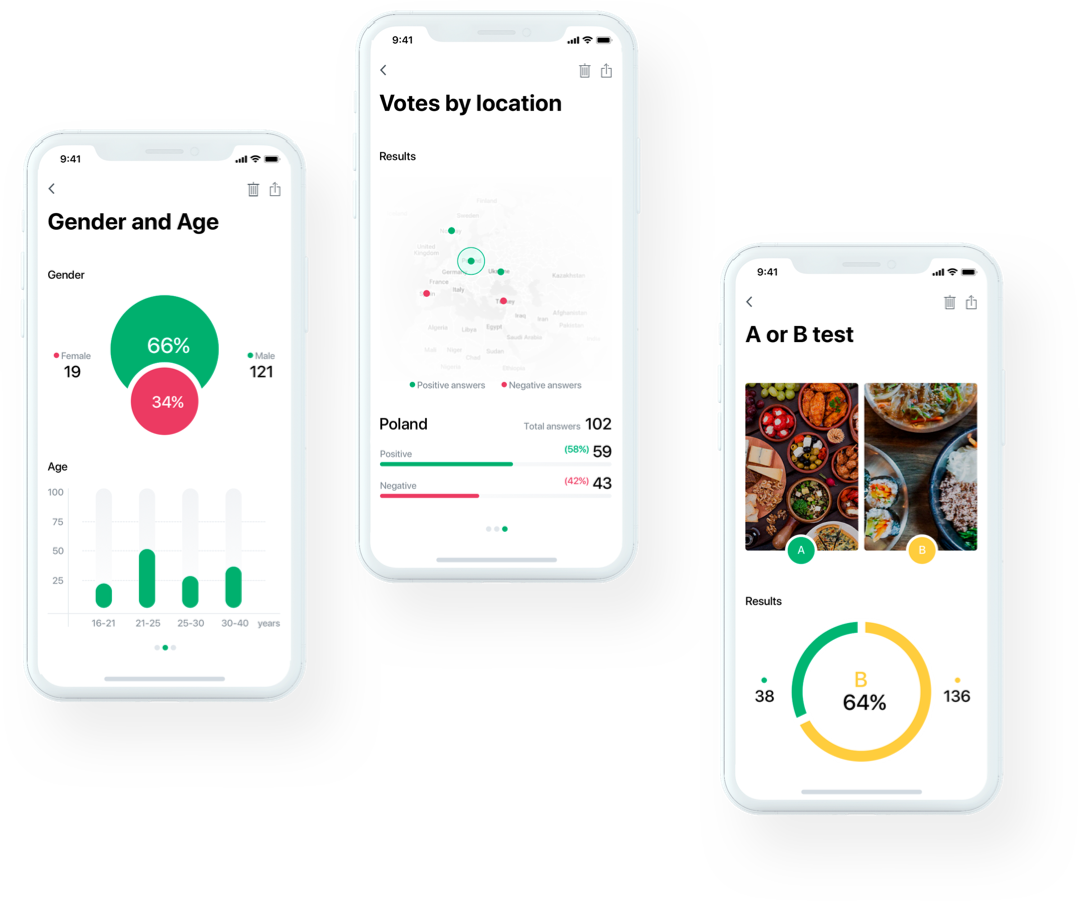
To help businesses orient themselves based on data gathered by Vootex, we designed the analytics features to be clear and engaging and let businesses extract the most intelligence from the data. We displayed analytics data so that it’s easy to perceive using minimum elements and two-color sets.
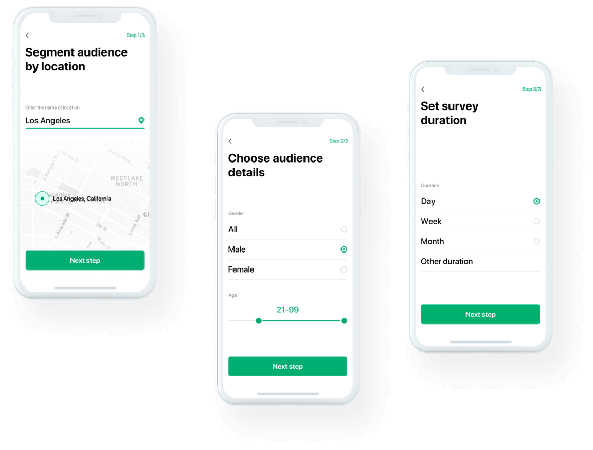
Clear UI elements for voting and survey features
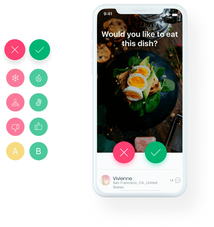
For the product, it was necessary to offer a comprehensive solution for taking surveys and voting. To ensure that the voting feature provides a wide range of functionality while keeping the design sleek and striking, our team used groups of buttons that look like emojis providing familiar experience to users.
Custom Mascot
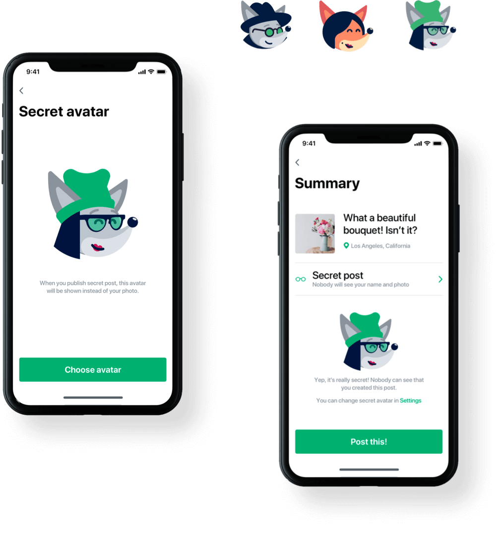
To make the application more recognizable, we came up with a mascot idea that would be lively, build positive emotions, and convey the product's tone and voice.
We created a friendly fox that takes users through the app, from onboarding to interacting with others and participating in surveys.
Results
The Vootex app provides comprehensive capabilities for companies that want to test their product idea or improve existing goods. Our task was to create a design for this feature-rich analytics tool in a user-friendly form to attract users and make the voting process fun.
UGEM handled all the design concept for our application. They came up with an idea for how to wrap a market research tool into an appealing and interactive social voting application.
Vlad Gorodetsky
Vootex, Founder
